Plotly – An Interactive Visualizations Library
Generally the Python developers use the Matplotlib data visualization library to generate basic visualizations. Other popular option is Seaborn which is also based on Matplotlib but it provides some better visualizations. Developers working on Pandas dataframes at times use the default visualization provided within Pandas. But all these data visualization libraries have a limitation, the visualizations generated by them is a static image. This is where Plotly comes in which provides interactive visualizations to the user so that they can perform some actions on the visualizations like selecting data points, zooming-in on specific areas and other such actions.
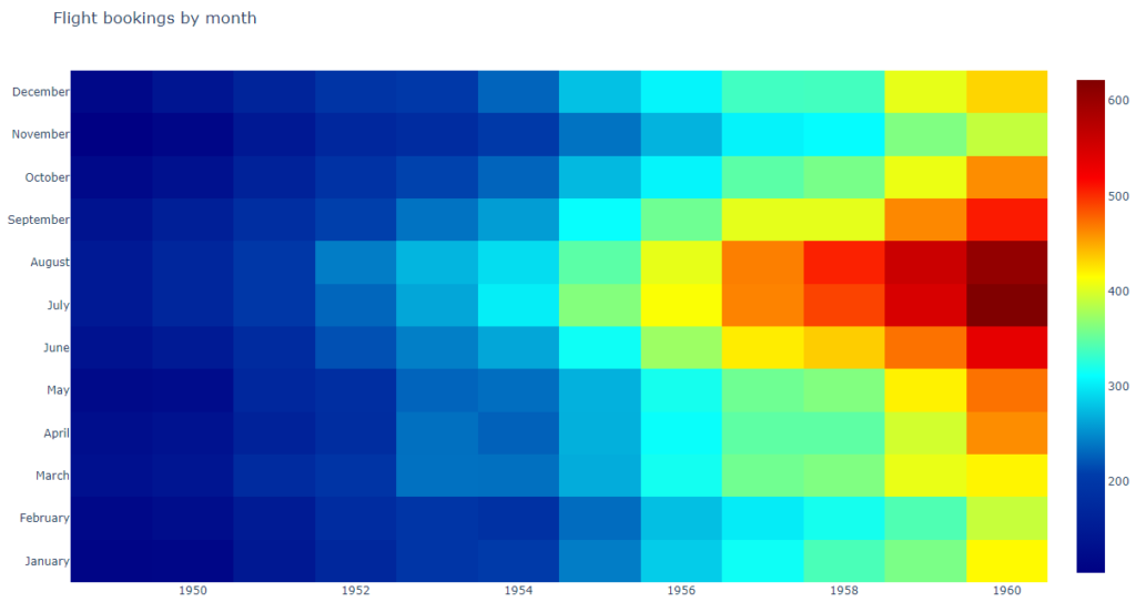
This blog will explain the key components needed to create a Heatmap in Plotly. We will use a publicly available flights data from abalone.csv. Basic assumption is that your machine has Python setup along with the required dependencies needed to import the Plotly libraries.
Import Dependencies
First import the following Plotly libraries and also the Panda library if you need it to read data from external sources. Then read the data into a dataframe ‘df’.
import plotly.offline as pyo
import plotly.graph_objs as go
from plotly import tools
import pandas as pd
df = pd.read_csv('flights.csv')
Gather Data
Use Plotly’s graph objects feature to define heatmap properties using ‘go.Heatmap‘ command. The graph objects defined are assigned to a list object. Since it is a list you can allocate multiple objects to the same data variable.
data = [go.Heatmap(
    x=df['year'],
    y=df['month'],
    z=df['passengers'],
    colorscale='Jet'
)]
Define Chart Layout
Now you need to define the layout of the chart using ‘go.Layout‘ command.
layout = go.Layout(
    title='Flight bookings by month'
)
Plot the Chart
Finally you combine the graph data and the layout definition to prepare the figure using ‘go.Figure‘ command. The figure object is then passed onto the ‘plot‘ function to draw the chart.
fig = go.Figure(data=data, layout=layout)
pyo.plot(fig, filename='FlightBookingStats.html')
The final chart is generated as an HTML which will be opened in the default browser. If the chart doesn’t open then you can also open the file manually in your browser of choice.
What Next?
Plotly supports many other kinds of visualizations. I would recommend you to go through the samples available on the official website.